GETTY
ALL FOR ART
Getty is more than a museum — it's a Conservation Institute, Research Institute, Trust, and Foundation. They came to us with a challenge: to refresh their current visual identity and messaging system to be distinctive enough to unify a global organization, while reflecting Getty's mission to advance art's meaning and impact.
Client: Getty
Agency: FRED & FARID NY
ECD: Laurent Leccia
Art Director: Helen Hulsey
Copywriter: Lorena Saldaña
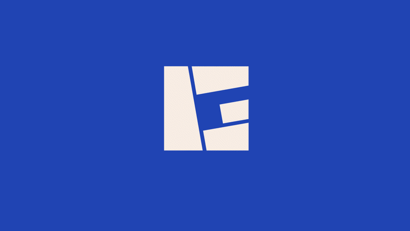
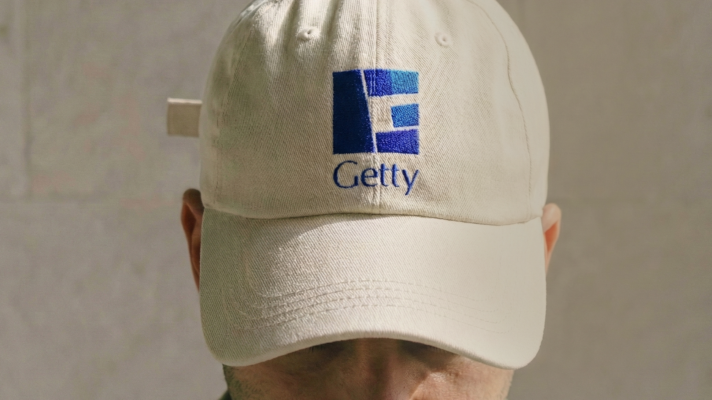
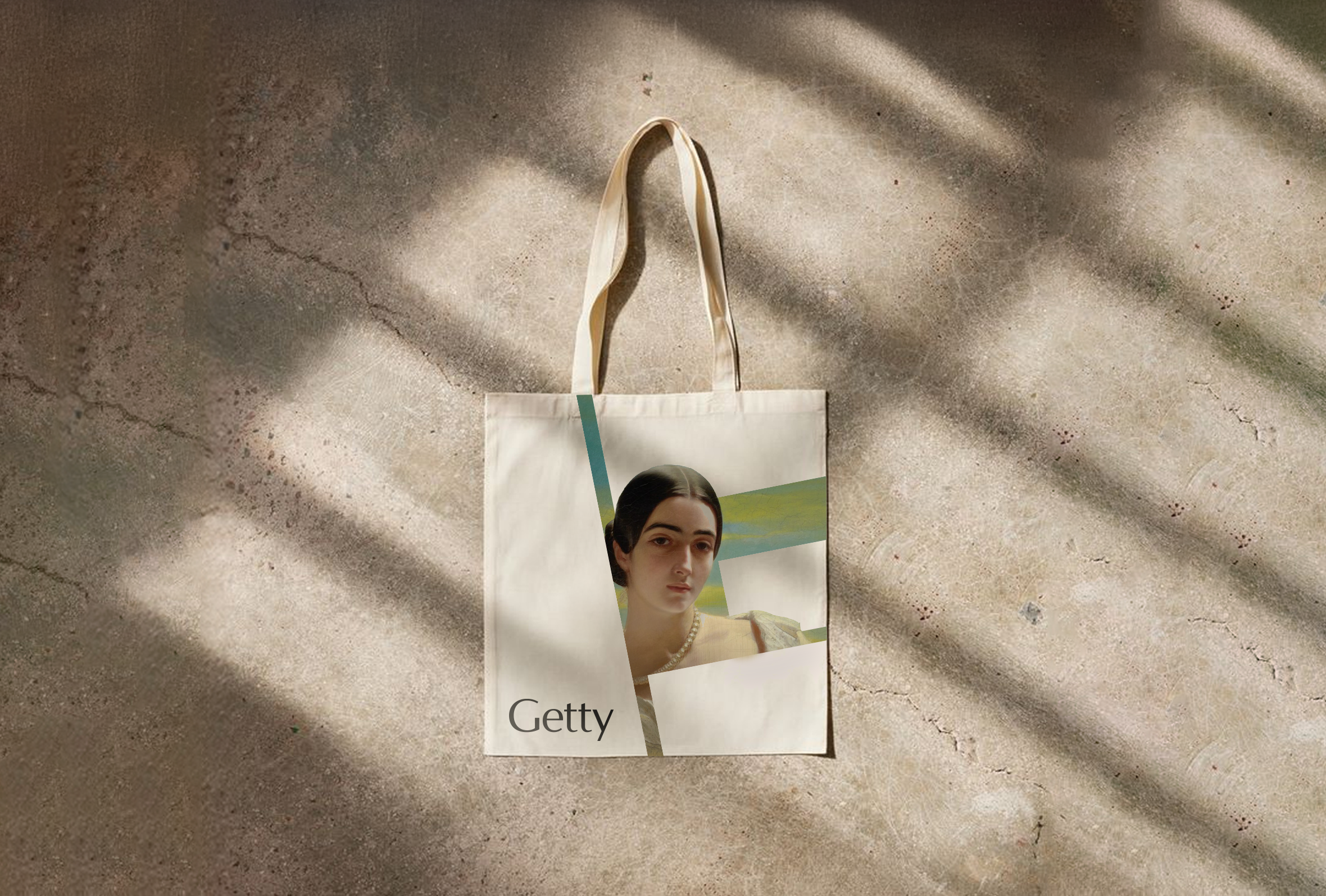
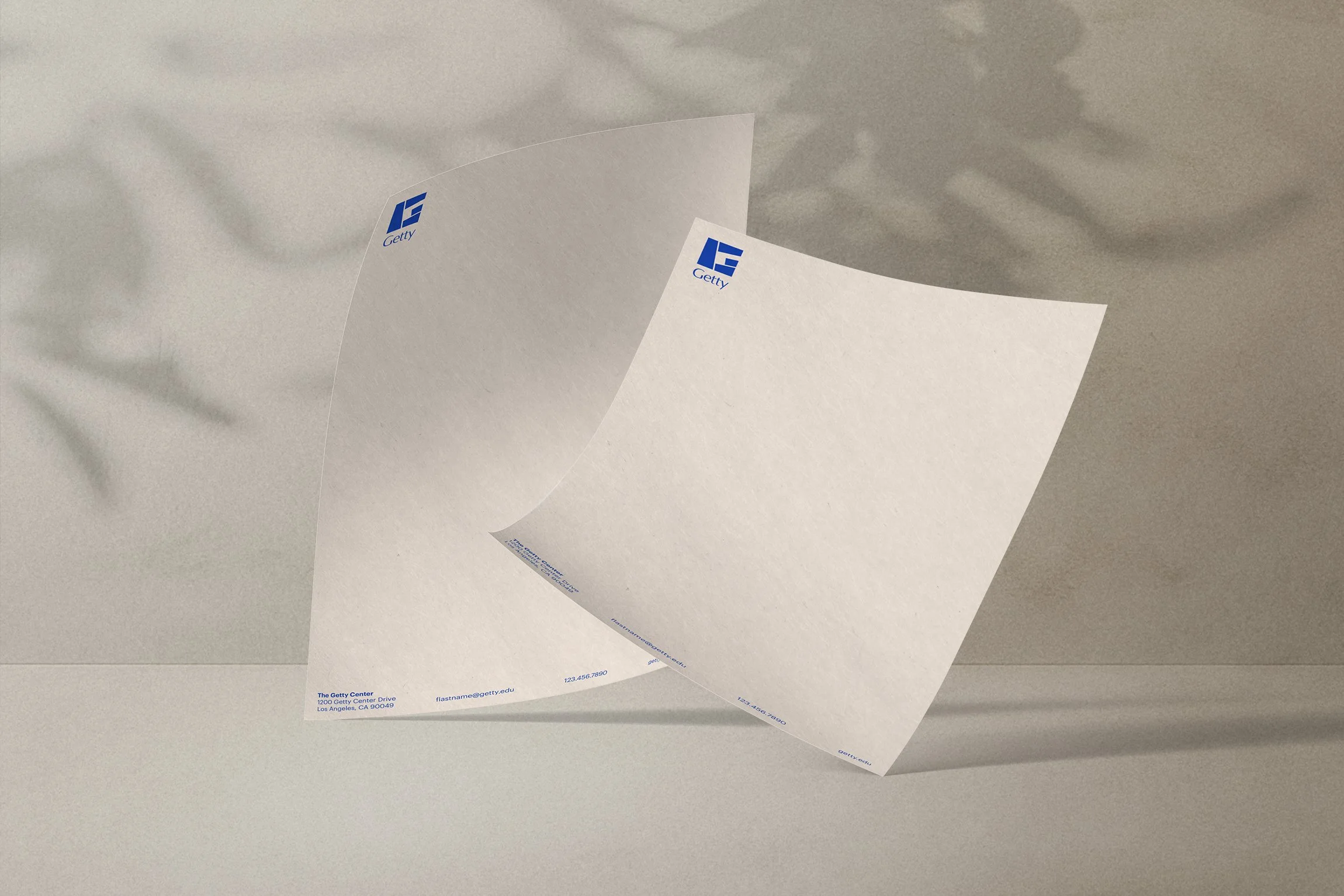
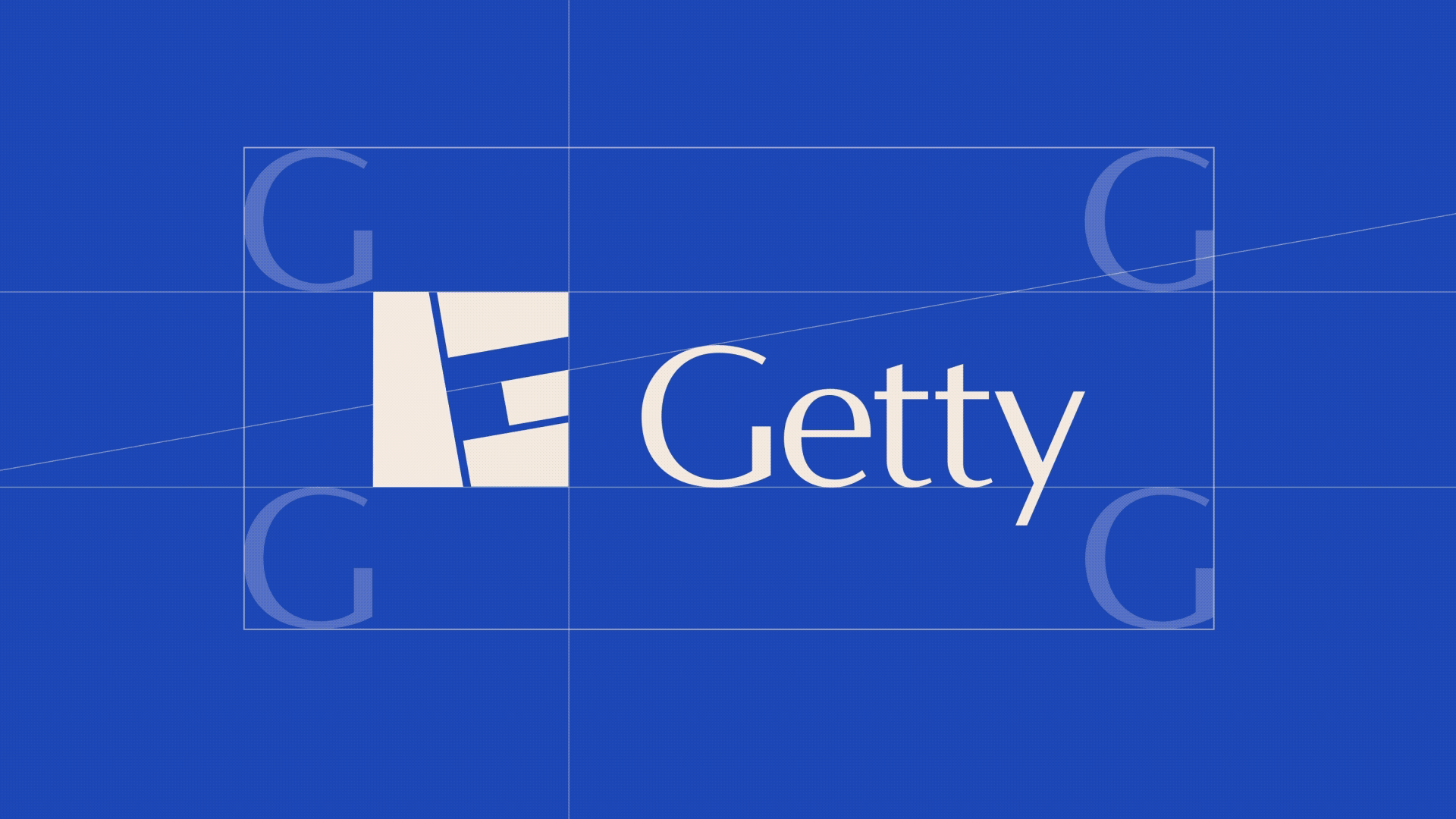
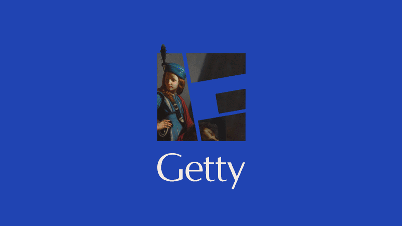
We designed a new "G,” a visual addition to the most recent Getty logo. The square block references Getty Center's travertine architecture; the four mosaic-like fragments pull from Getty Villa's visual language and represent each of Getty's core programs. The result is a flexible identity element built to flex across contexts and scale.

The system retains Graphik, a modern, legible font built for digital and distills the color palette to a focused suite derived from Van Gogh's Irises, one of Getty's most iconic works.
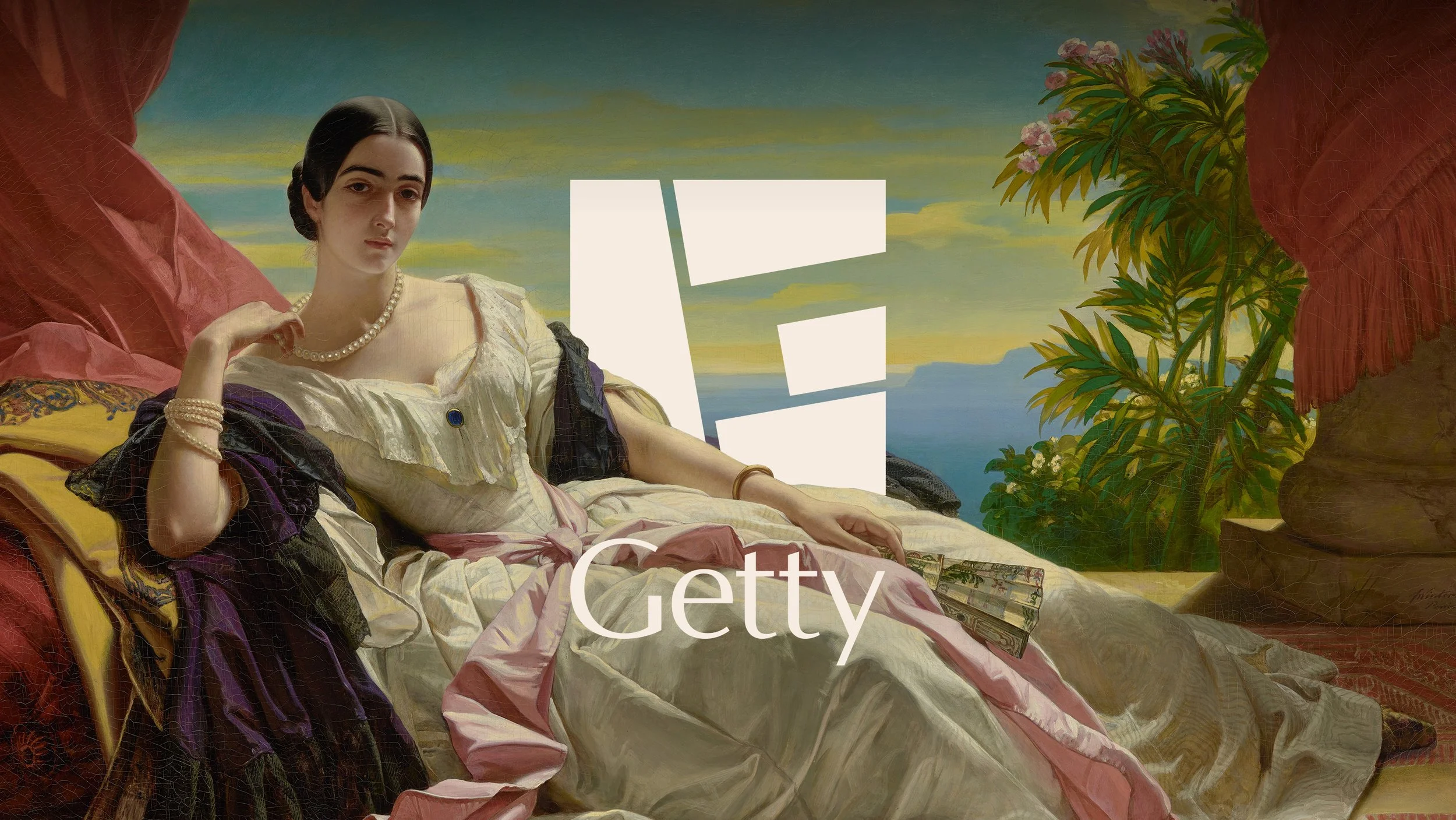
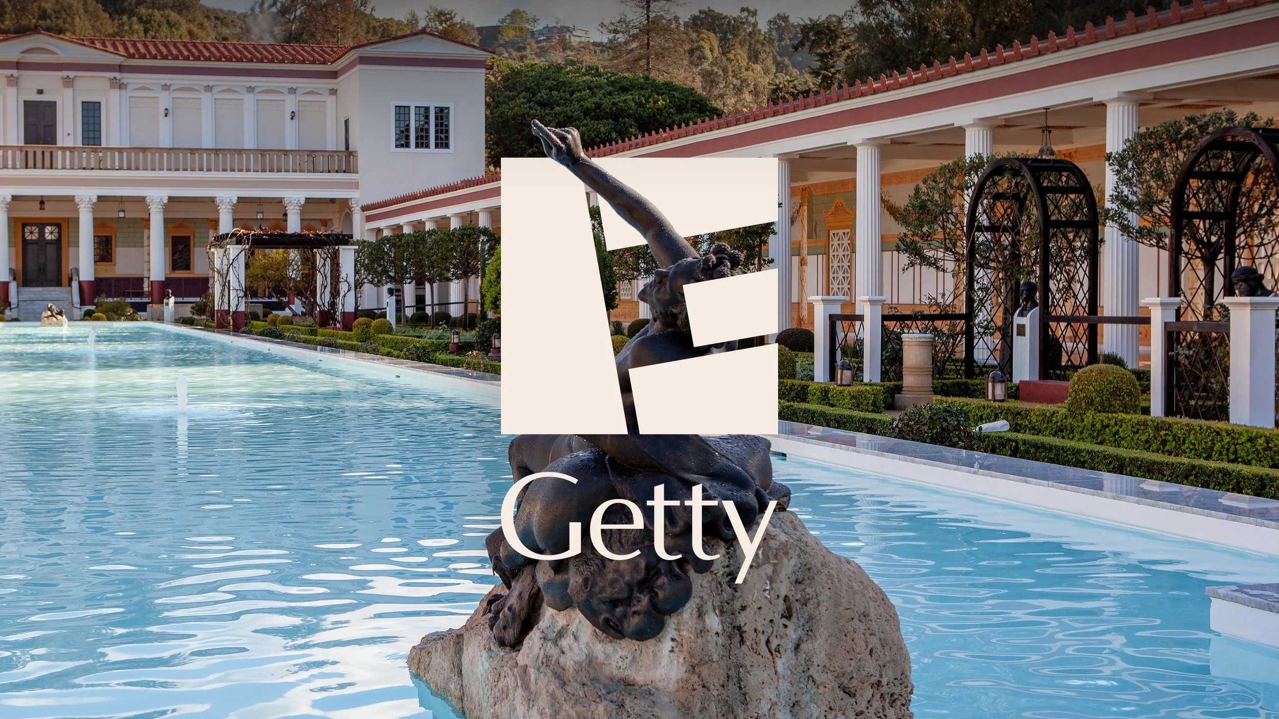
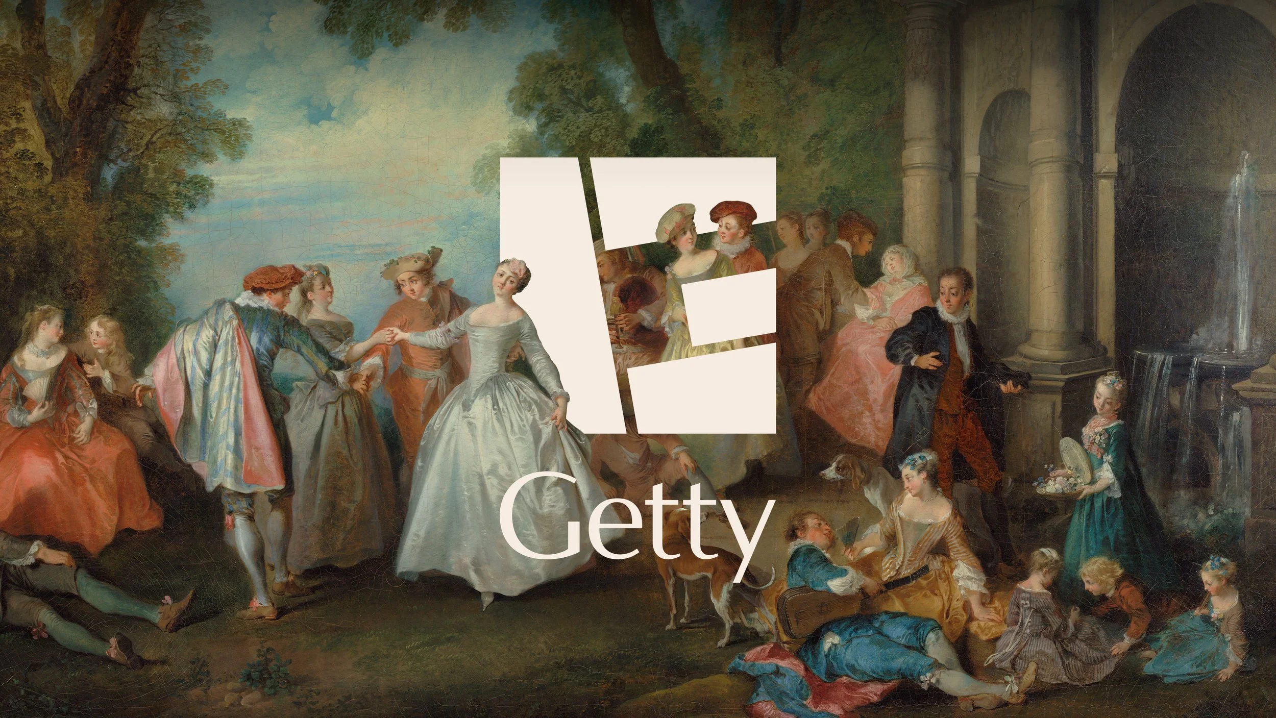
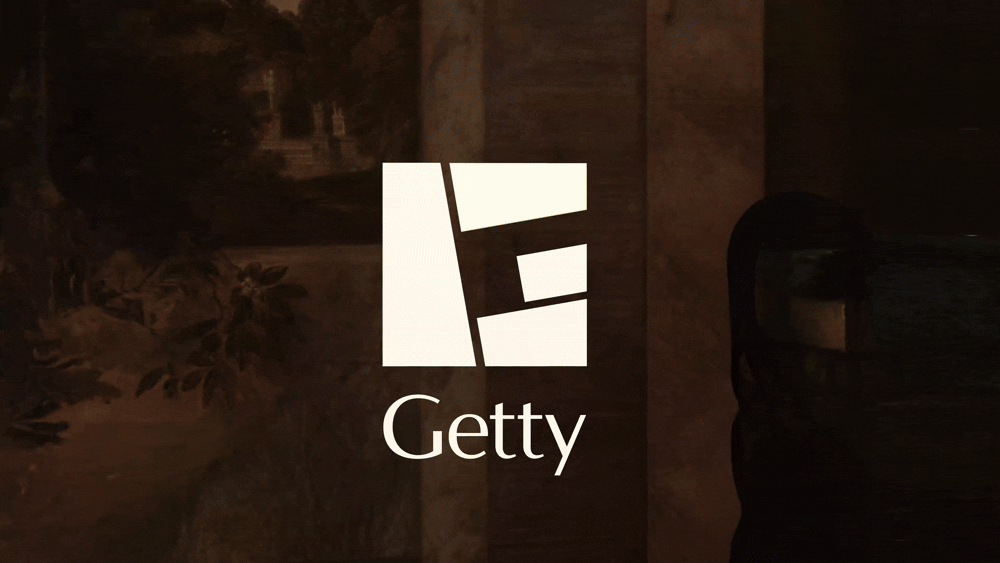
The Getty G Mark can function as a frame for artwork and imagery…
…or it can open entirely, a dynamic 3D element that brings a new dimension to the art.
The system is built to adapt and grow with all of Getty’s needs, scaling seamlessly over time.